
This one of a kind Reserve Card is specially designed for a specific blend of Sumatran coffee that will be sold at the Starbucks Reserve stores in Milan, Italy and Shanghai, China.
The creative brief did not contain directives or mandatories as it pertains to the creative expression. They had some input regarding the verbiage, but beyond that, the BU was open to whatever I could come up with.
First things first, I had to dive deep into the world of the Indonesian island of Sumatra for design inspiration. I was fascinated with what I found. There’s an amazing array of unique flora and fauna on the island. It’s incredible that such a small space can hold such a large amount of beautiful wildlife. I also came across quite a wealth of antique traditional Indonesian textiles. I knew that I wanted to use either the life on the island or the history of the island in my initial sketches.
For the text, I was pleasantly surprised to learn that we could use a non-Starbucks brand typeface for this project. I do love the Starbucks type treatment, but I also enjoyed being able to find a unique font that captured the essence of this project. So, during my research, I came across a few unique styles of text that were featured on a wide range of print pieces in Indonesia. I hoped I could find a similar style font in our type library.
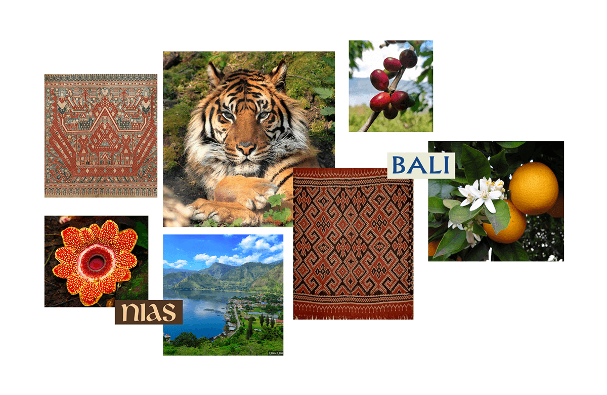


Here is how the sketching process looked. The first version featured a very ominous-or seductive, depending on how you see it, Sumatran tiger. The backdrop features the Barisan Mountain range & the Terraced Fields in the distant background. The giant rafflesia flower, native only to Sumatra, is featured prominently, as well as coffee cherries. The orange blossom is also present, to signify flavor notes present in this blend.
The second sketch features an illustrative version of the patterns I found in some of the textiles that came up during my research.
For color, I knew that I wanted this card to be alive and full. I pulled colors from the textiles, and from the nature that is present in Sumatra. Everyone, including me, was stoked about this color palette. Earth tones live with bright colors, and I feel that it’s fresh and unique.
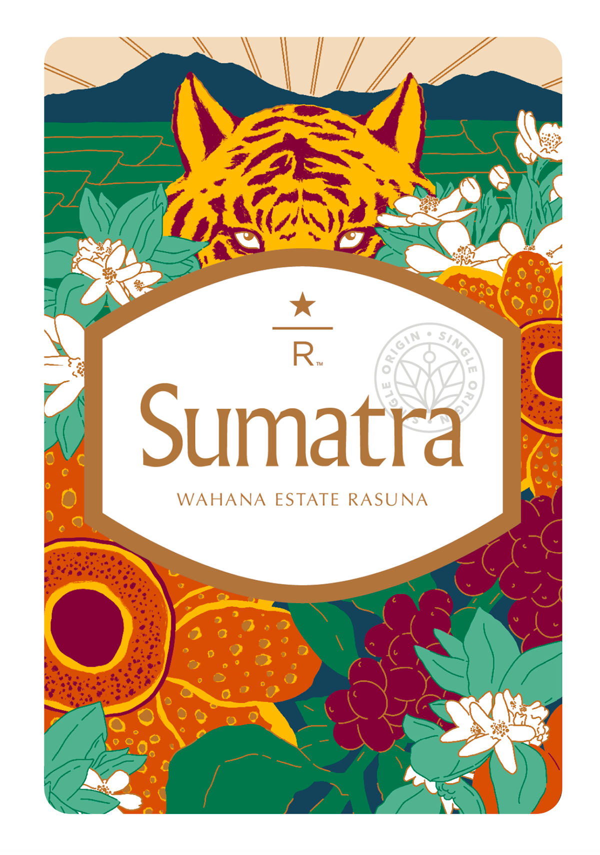
What you see here is the final product. I’m very happy with it, and the BU loved it.
One note about this project that I found interesting was the back and forth when it came to the copy on the front of the card. I know there’s a lot to the story that is told on the back of the card, but it could be assumed that the copy for the front of this card would be pretty easy to nail down. Not so with this. With invaluable input from Megan Oost, the writer for this card, we forged ahead. Megan guided the ship, going back and forth with the client on the title and subtitle. The hierarchy was questioned and tweaked several times. Once that was cleared up, we could apply the finishing touch of the copy treatment. I mentioned earlier that during my research, I discovered a type style that was prevalent in Indonesia. Well, I found a similar font in our type client library, and I went to work on the layout out the headings.
It’s a shame that I won’t be able to purchase this coffee, as it is only being sold in China and Milan. That being said, I’m very proud to have worked on this project and I’m even more proud that the work was well-received and appreciated. Admittedly, I’m really looking forward to when I get to create another Reserve card. This project, process and all, was very enjoyable and rewarding.


Thank you for your time!